Pilgrimages to Santiago: Power BI Report
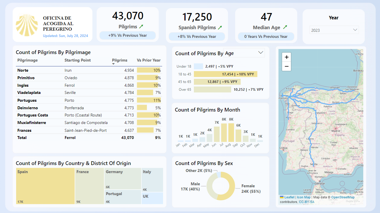
Have you ever looked at something and just couldn't get that persistent voice out of your head - "I can do this too, but better!" This is what happened to me when I saw the dashboard of the Santiago Pilgrimage Office. For once, I decided to act.
Intro
In summer 2024 I decided that I want to go for something special for my holidays, namely a pilgrimage to the cathedral of Santiago. Spanish countryside, amazing weather, fantastic food and just being outside for two weeks sounded just right for someone who spends 12+ hours daily staring into screens of different shapes and sizes.
And when I found out that Santiago's pilgrimage office publishes official statistics about pilgrimages I completely nerded into it. There was one issue however - I was excited with the data but I did not like the dashboard.
The Cons
- No Full Outlook At Glance: dashboards work best when all the key info is visible together. Extensive horizontal and vertical scrolling makes exploration difficult.
- Excessive Use of Color: overusing vivid colors makes it harder to guide attention to the key insights.
- Lack of Context: a single number has little value by itself; comparison against time, targets, and related metrics creates meaning.
My Version
The dream is for this dashboard to be used on the actual website of the pilgrimage office. I have already reached out to them, and now I am hopeful for a positive response.
Design Considerations
- Geospatial Insight
As someone who works mostly with tabular finance data, expanding into maps, trails, and coordinates was a new challenge. iconMapV3 in Power BI, plus shared trail data and some Python, made it possible.
- Generating Artificial Data
I did not have access to all real-world pilgrim-level statistics, so I generated synthetic data with Python and prompting support from ChatGPT. The key was ensuring varied distribution so the dashboard remained analytically useful.
- User Navigation
Even with a clean design, many users are new to interactive dashboards. A short onboarding overlay and guidance text can materially improve usability.
Interactive Dashboard
Contacts
LinkedIn - Stepan Khramov